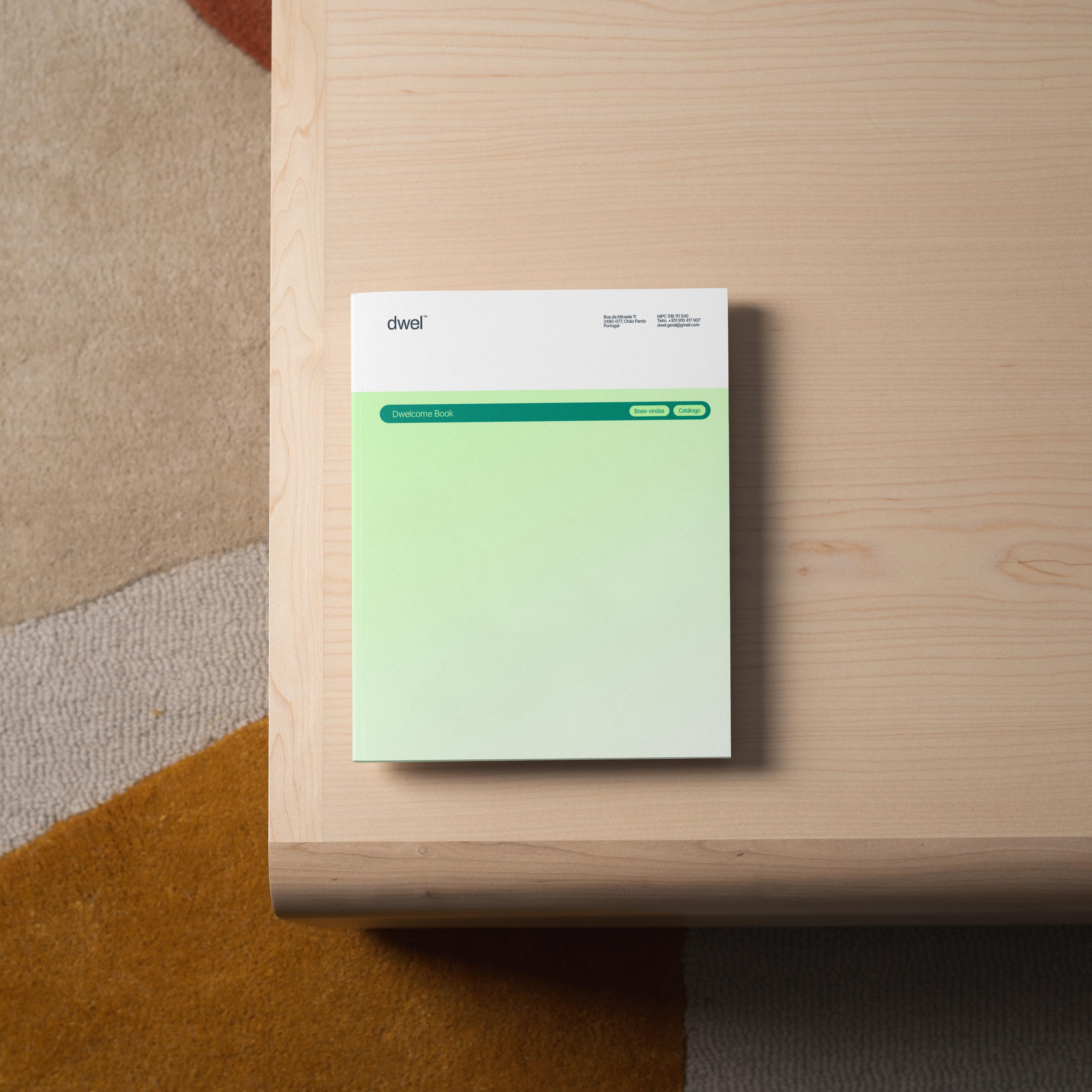
Before the logo there is a process, and that is where the brand is decided
A brand designer starts working long before the first sketch and keeps working long after the files are delivered. That process, not the symbol, is what separates an identity that holds up from one you rebuild in two years.
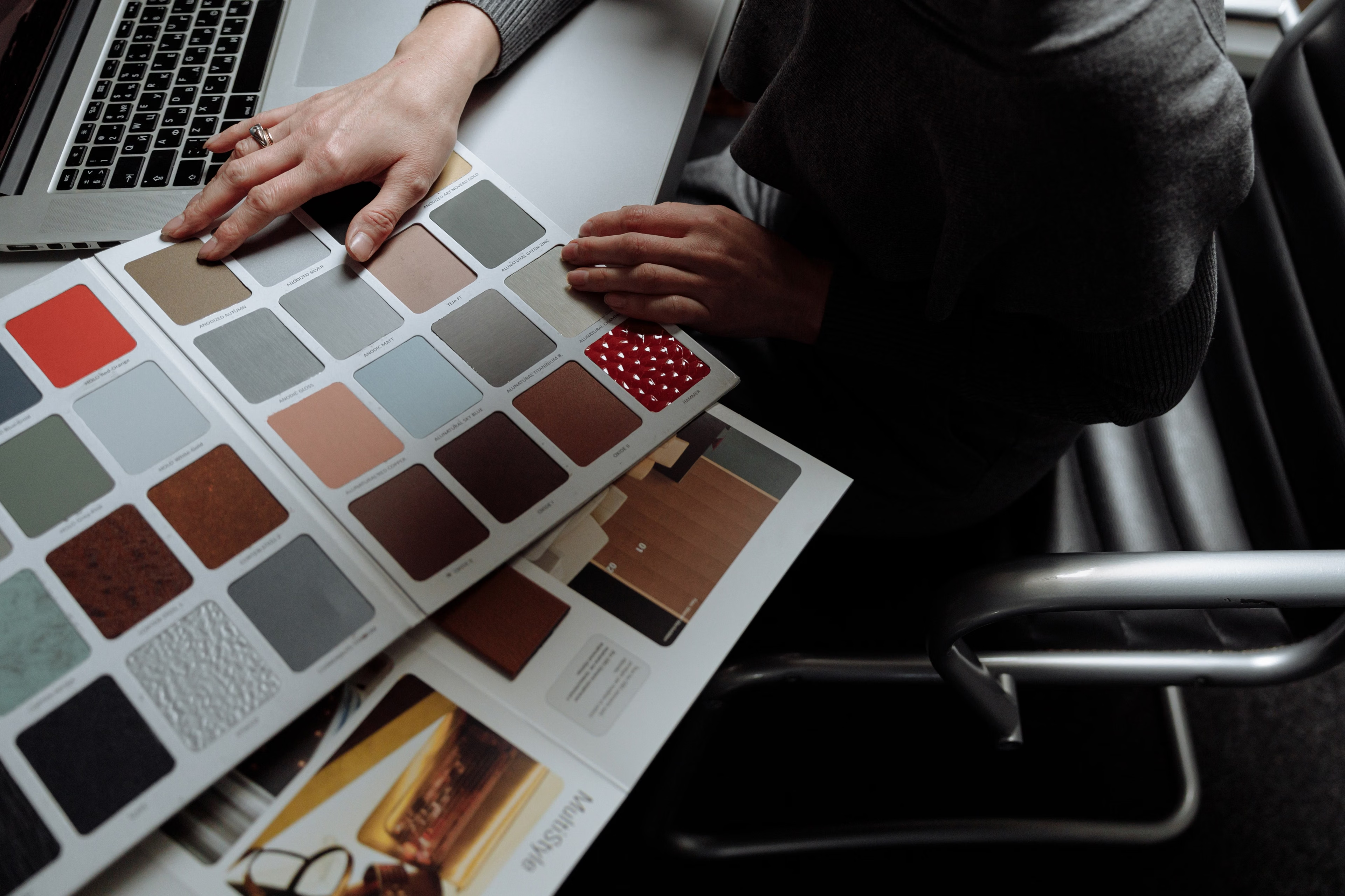
When a business asks for a logo, a logo is rarely what it needs. It needs to be recognised, chosen and remembered in a market where other people are already selling the same thing. A nice symbol does not solve that. A process does, and most of that process happens where the client never sees it, even though it is the part that decides the outcome.
The brief is not paperwork
Before opening any design tool, a designer asks questions most business owners have never had to answer in writing. What does this business actually do better than the alternatives? Who buys, and what makes them decide? Which objections come up in every sales conversation? Where will the brand be seen: on a card, on a shopfront, in a local ad, on a phone screen at eleven at night?
Those answers are raw material. Without them, the identity ends up resting on the personal taste of whoever drew it, and personal taste is not a business criterion.
Research before direction
Next comes the least glamorous and most decisive stage: reading the terrain. The designer maps direct competitors, the visual codes of the category, what is already saturated and what nobody is occupying. If every clinic in town uses blue, rounded type and the same stock photography, blue has stopped being a choice and become noise.
This stage exists to remove risk. It avoids look-alikes that confuse buyers, avoids collisions with names already registered, and avoids spending the budget on a direction the market will not distinguish. Checking availability early, through a register such as EUIPO, costs far less than discovering the problem after launch.
Positioning first, aesthetics after
Only once the research is in does anyone decide what the brand will say, to whom, and in what tone. Personality, promise, vocabulary, and the things the brand will never say. This is what separates a studio that delivers files from a studio that builds a position.
The back and forth between opening options and closing them has been documented for years in the Design Council framework used by design teams across Europe. Diverge to explore, converge to decide, twice over.
Visual territory and concepts
Only now do the mood boards, type tests, palettes and first drawings appear. When a designer presents two or three routes, they are not offering three flavours. They are offering three positioning hypotheses translated into form, and each one moves the brand to a different place in the buyer's head.
At that point the choice stops being a matter of preference and becomes a business decision, argued from everything the earlier stages produced.
A logo is a file, an identity is a system
The symbol is the most visible piece and the least important one. What carries a brand day to day is the system around it: logo variants for different contexts, clear space, minimum sizes, a palette tested for contrast, type hierarchy, grids, photographic direction, iconography and unambiguous rules of use.
All of it lives in a set of brand guidelines. That is what allows someone on the team to build a poster three years later and still have it look like the same company. Without guidelines, every new piece renegotiates the brand from scratch.
The second job: the website
A website is not a new brand. It is the same brand in motion, and it is usually the first place the system is properly stress tested. The web designer turns palette, type and spacing into reusable components, decides how the brand behaves on small screens, what happens in error states, in forms, on a slow connection.
This is where criteria you can measure replace criteria you argue about: contrast and keyboard navigation under the WCAG, loading and visual stability under Core Web Vitals, semantic structure for search. An identity that ignores those arrives in the browser broken, however well it presented in a PDF.
Why this is safer than buying a cheap logo
A logo bought for the price of a dinner solves one immediate problem and creates three deferred ones. It usually arrives with no usable vector files, no variants, no rules, and sometimes no real exclusivity over the mark. No research was done, so nobody checked whether it already exists in the same category. No positioning was set, so the website that follows has no guidelines to follow and every page ends up looking like a different company.
The cost lands later, when everything has to be redone with the business already trading, with printed signage, vehicle liveries and customers used to something else. McKinsey tracked hundreds of companies over five years and found that those treating design as a managed function, with process and measurement, consistently outgrew their industry peers in both revenue and shareholder returns.
When the two jobs are really one
Identity and website can be separate projects, but when they run together, or at least share the same process, the second inherits every decision made in the first. Less time, less rework, and a brand that says the same thing at every touchpoint, from the business card to the contact page.
For a company in Rio Maior, Santarém or Leiria competing against larger players with bigger advertising budgets, coherence is one of the few advantages actually within reach. It does not come with a logo. It comes with a process.
In plain words
- Brief: The opening document that gathers objectives, audience, context and constraints for a project, and underpins every design decision that follows.
- Mood board: A panel of visual references used to align tone, colour, typography and atmosphere before any final artwork is produced.
- Positioning: The place a brand occupies in the buyer's mind relative to competitors, and the promise that keeps it there.
- Brand guidelines: The document setting out how the brand must be applied: logo variants, colours, typography, spacing and prohibited uses.
- Design system: A set of reusable components and rules that translates the identity into a digital product, keeping pages and screens consistent.
- WCAG: Web Content Accessibility Guidelines, the W3C standards defining minimum accessibility criteria such as contrast and keyboard navigation.
- Core Web Vitals: A set of Google metrics measuring loading speed, interaction responsiveness and visual stability of a web page.
- EUIPO: European Union Intellectual Property Office, where EU trade marks are searched and registered.